This post is an excerpt from “Visual Logorrhea – On the Prevalence of Slideuments”. In order to get an impression of the current use of PowerPoint for presentation design, 1.500 presentations found on the internet have been analyzed. Read the full story here.
Font Sizes
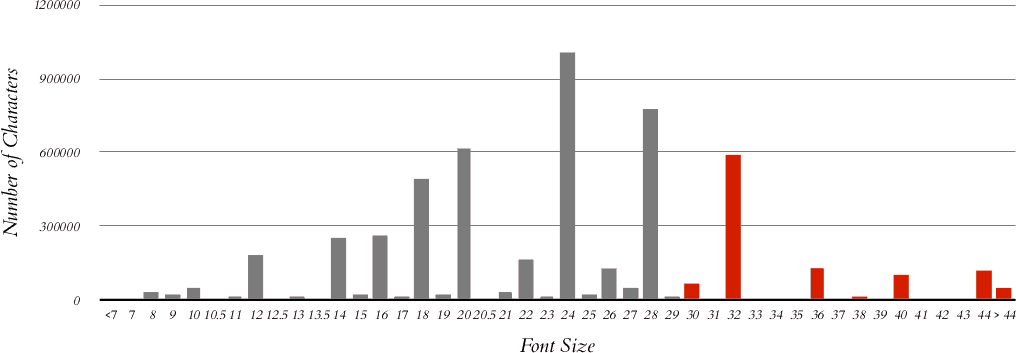
The font size within a shape containing text can vary, consequently, font sizes have been analyzed by “run” (which is a continuous sequence of text of the same formatting as regards font type, size and emphasis). The frequency is shown based on both number of occurrences and the actual count of characters (not including whitespace).
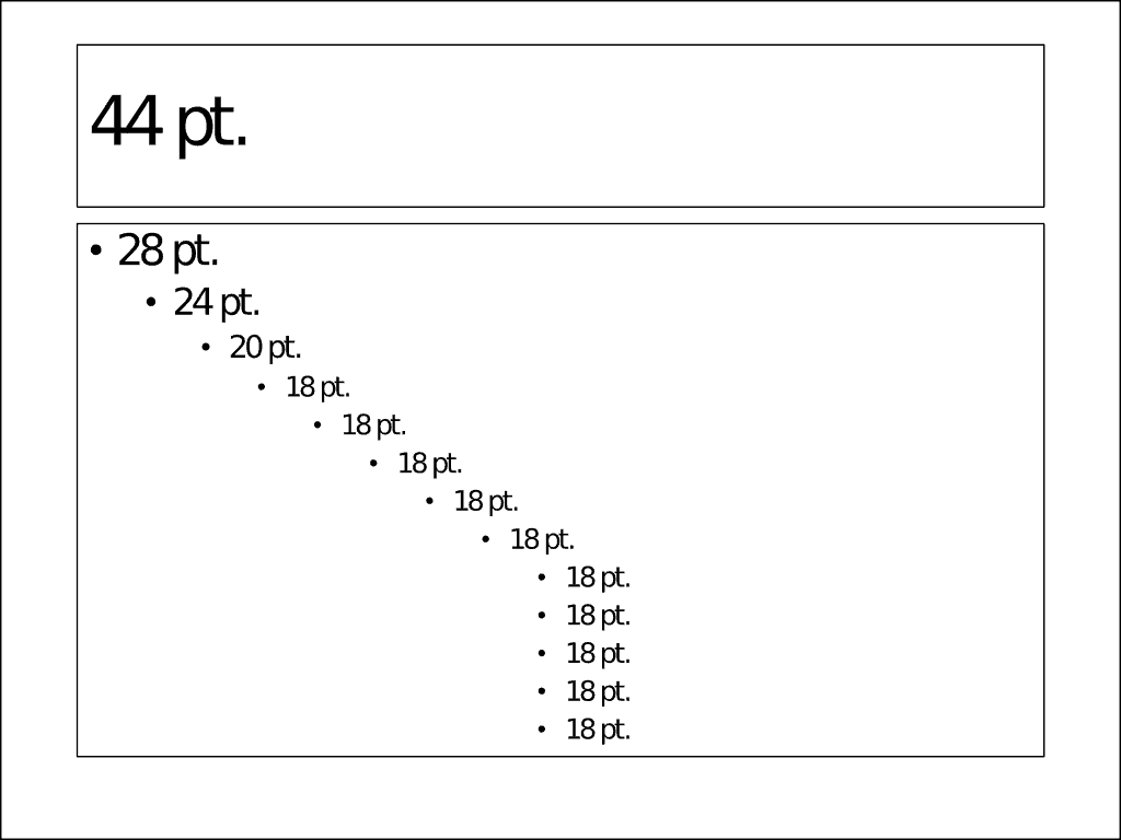
The font size distribution practically follows the defaults of Microsoft PowerPoint, especially the defaults for hierarchical bullet lists (for PowerPoint 2013: 44 pt. for the slide title, 28, 24, 20 and 18 pt. for the text). This leads to the assumption that at least in bulleted lists, there is very little custom design work being done.
 Recent versions of PowerPoint automatically adjust the font size in a shape as needed in order to fit any amount of text into the shape. For example (as of PowerPoint 2013), the font size of the slide title is reduced to 40 pt. when needed and the font size of bullet lists is decreased in steps down to 5 pt. In addition, when decreasing the font size manually, PowerPoint does this in certain steps (44, 40, 36, 32, 28, 24, 20, 18, 16, 14, 12, 11, 10.5, 10 pt. and further down to 1 pt. [sic] in one-point steps). Thus, the only unanticipated outcome of the font size spectrum above is the very low prevalence for 10.5 point.
Only about one quarter to one fifth of the textual presentation content follows Guy Kawasaki’s recommendation to use a minimum font size of thirty points (25.6% of all occurences, 19.7% of all characters)1. Taking into account that a considerable amount of text written in larger font sizes is contained in slide titles, virtually no actual presentation content honors his advice.
Assuming that 24 pt. is the smallest font size readable by anybody in a larger audience, more than two fifth of all text is at least barely readable (if not too small to read) – an additional distraction for the audience, beyond the distraction already caused by far too much text.
This post is an excerpt from “Visual Logorrhea – On the Prevalence of Slideuments”. In order to get an impression of the current use of PowerPoint for presentation design, 1.500 presentations found on the internet have been analyzed. Read the full story here.
Footnotes:
- ↑ Kawasaki, Guy, “The 10/20/30 Rule [sic!] of PowerPoint,” December 30, 2005,
http://blog.guykawasaki.com/2005/12/the_102030_rule.html (accessed January 1, 2014),https://guykawasaki.com/the_102030_rule/ (accessed February 20, 2017).


