This post is an excerpt from “Visual Logorrhea – On the Prevalence of Slideuments”. In order to get an impression of the current use of PowerPoint for presentation design, 1.500 presentations found on the internet have been analyzed. Read the full story here.
Font Choices
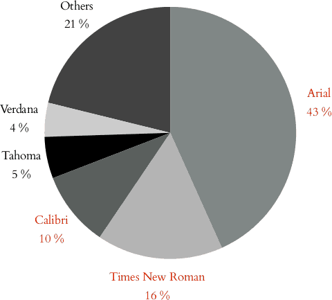
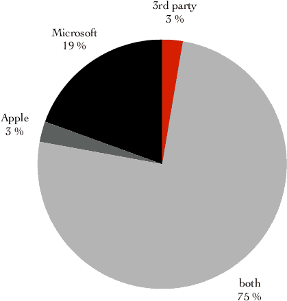
 Most of the characters have been formatted in a font which has been or is PowerPoint default (Times New Roman, later Arial and now Calibri, together 69.2%). 95% of all text found on the slides is formatted in a font which is delivered with the operating system (Microsoft Windows1 or Apple Mac OS2) or Microsoft Office. We can assume that the distribution of fonts about exactly follows what was the default at time of creation (of the presentation or the presentation template it is based on). In conclusion, most of the presentations or their respective templates might not conform to corporate standards (which do not base on default fonts in many cases).
 Only 3% of all text is formatted in a font supplied by 3rd parties – another indication that there are almost no specific design customizations being done (and that practically nobody wants to pay type foundries or font designers for their work – or at least look for a suitable free font). Font choice is largely not recognized as a way to differentiate; in particular for recent presentations created using the very distinctive Calibri font, this is more than evident: “You cannot use Calibri and expect to create a ‘PowerPoint that does not look like PowerPoint.’”3
In summary, compared to the ubiquity of text, the importance of font choice appears to be astonishingly underrated.
This post is an excerpt from “Visual Logorrhea – On the Prevalence of Slideuments”. In order to get an impression of the current use of PowerPoint for presentation design, 1.500 presentations found on the internet have been analyzed. Read the full story here.
Footnotes:
- ↑ Microsoft Inc., “Microsoft Typography — Fonts and Products”, Accessed February 16, 2014, http://www.microsoft.com/typography/fonts/. Microsoft, PowerPoint, Office and Windows are either registered trademarks or trademarks of Microsoft Corporation in the United States and/or other countries. All other company and product names may be trademarks of their respective companies registered in the United States and/or other countries. PowerPoint as the predominant application for presentation creation merely serves as an example in this document. It is assumable that most of the findings will apply to other products of the same class, too.
- ↑ Apple Inc., “OS X: Fonts included with Mountain Lion”, Accessed February 16, 2014, http://support.apple.com/kb/HT5379. Apple and Mac OS are trademarks of Apple Inc., registered in the U.S. and other countries.
- ↑ Schultink, Jan, Pitch It!, (Axiom One Ltd., 2012), accessed and updated February 14, 2021, https://books.apple.com/de/book/pitch-it/id584824855.
