This post is an excerpt from “Visual Logorrhea – On the Prevalence of Slideuments”. In order to get an impression of the current use of PowerPoint for presentation design, 1.500 presentations found on the internet have been analyzed. Read the full story here.
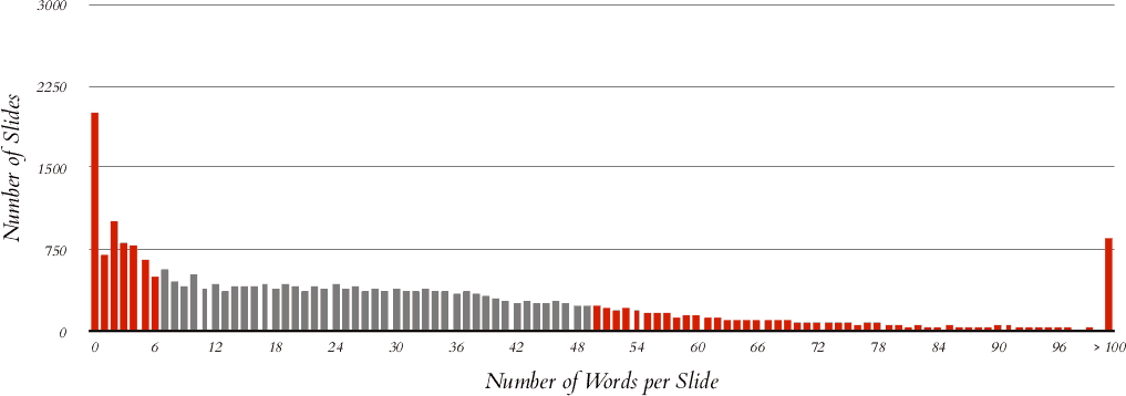
Word Counts
Nancy Duarte – referring to and further specifying Garr Reynolds’ critics on slideuments – differentiates between slides packed with “more than 75 words” and thus being a “document or whitepaper”, slides containing “50 or so words” which “serve as a teleprompter” and “true presentations” which “reinforce the content visually”.1
10.7% of all slides in the sample are what Nancy Duarte calls a “teleprompter” (50 – 69 words), 9.2% are what she defined as a “document” (70 or more words). This definitely does not mean that the remaining about 80% of the slides are highly visual or suitable as a good support for the orated speech. From the author’s experience, a highly visual slide as suggested by most authors cited in this publication does not need (or have space for) more than a couple of words; in fact, most of them follow Godin’s advice. Subtracting the 8% title slides, it is safe to say that only about a fifth of all slides in the sample might meet that criteria, whereas at minimum another fifth is to be considered a slideument.
This post is an excerpt from “Visual Logorrhea – On the Prevalence of Slideuments”. In order to get an impression of the current use of PowerPoint for presentation design, 1.500 presentations found on the internet have been analyzed. Read the full story here.
Footnotes:
- ↑ Duarty, Nancy, Slide:ology: The Art and Science of Creating Great Presentations (Sebastopol, CA: O’Reilly Media, Inc., 2008), 7.

