This post is an excerpt from “Visual Logorrhea – On the Prevalence of Slideuments”. In order to get an impression of the current use of PowerPoint for presentation design, 1.500 presentations found on the internet have been analyzed. Read the full story here.
Slide Counts
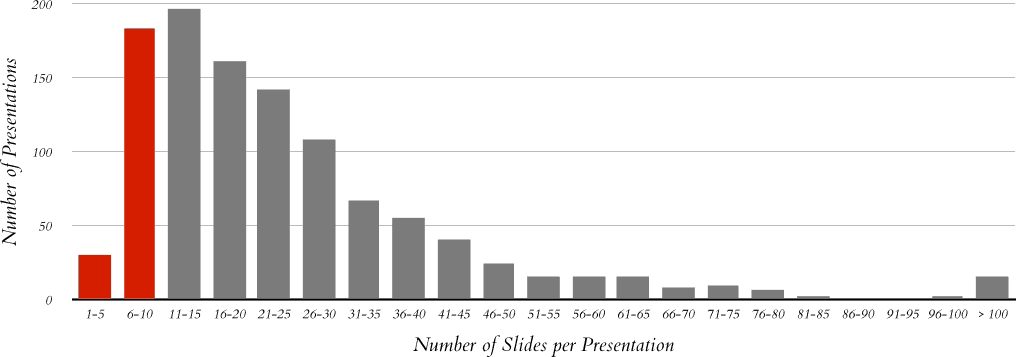
About half of the presentation files in the sample contain 20 slides or less. An average presentation consists of x̄ = 25.4 slides with a surprisingly high spread (s = 23.7) and a median of Md = 20. Only about 10% of the slide decks are larger than 45 slides.
Guy Kawasaki’s advice of a maximum of ten slides is only met by 19.4% of the presentations. This finding is not remarkable at all, because Kawasaki’s recommendation clearly focuses on pitches held in front of venture capitalists – a focus which might be shared by very few of the presentations in the sample analyzed.
The fact that there are only a few very long presentations is almost certainly related to the obvious truth that time constraints are the limiting factor for presentation length (and consequently are an indirect limit for the slide count). This limit appears to be widely understood by people creating slide decks.
This post is an excerpt from “Visual Logorrhea – On the Prevalence of Slideuments”. In order to get an impression of the current use of PowerPoint for presentation design, 1.500 presentations found on the internet have been analyzed. Read the full story here.

